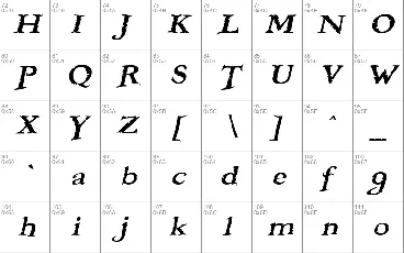
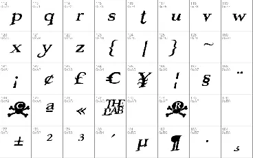
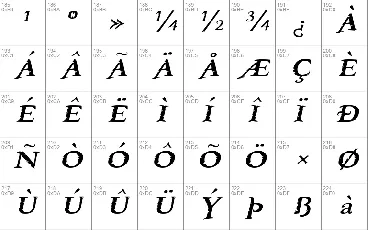
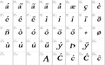
Ok, I am guilty!! I laid out plans and began working on this multiple master a while ago, maybe a couple months after my eyes first fell on Graham's magnificent Freebooter. The first time Graham heard about it was maybe about a month ago, when it was about 80% done. Graham's a good guy: he said he liked what I'd done with it so far, and gave me permission to proceed. You've gotta love him.
So here it is. Graham's expertly mischievous outlines turned into something that you can change with scrollers. Exercise your own gravitational pull. Stroke your own mouse. Slap your own ass. Do-it-yourself, do-it-yourself. Slinky, slinky, everyone loves a slinky.
It's been an awing experience going over the details of Graham's work. That F, that T, that g, I tell ya. It was a real pleasure layering these things back and fourth in Fontlab.
BooterMM has two axes: one for width and one for slant. The width one goes from 75% to 150% of the original Freebooter, and the slant one goes from the original straight-up to a maximum of 24 degrees, naturally passing by the original obliquing of 18-19 degrees.
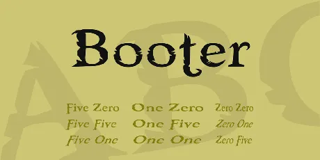
I also generated 9 single fonts for the true type users who do not want to deal with multiple masters. The styles and names of true type weights reflect main multiple instance axis markers in this fashion: One means 1000, Five means 500, and Zero means 0, with the width axis marker always preceding the slant axis marker in the font name. For instance: Booter One Five is actually BooterMM with the width axis set to 1000 and the slant axis set to 500 (maximum width, halfway slant), and Booter Zero One is BooterMM with the width axis set to 0 and the slant axis set to 1000 (minimum width and maximum slant). Of the true type weights the closest to the original Freebooter should be the Five Zero weight, and the closest to the original Freebooter Italic should be the Five Five weight. Not the same, but relatively close.
This is the third multiple master produced by the lab (RxMM and ImpossibleMM are the others). There will of course be many more as time allows. So stay tuned and tell a friend.
© Graham Meade and Apostrophic Labs. All rights reserved. Outlines by Graham Meade, space geometry by Apostrophe. [email protected]
This fonts are authors' property, and are either shareware, demo versions or public domain. The licence mentioned above the download button is just an indication. Please look at the readme-files in the archives or check the indicated author's website for details, and contact him if in doubt. If no author/licence is indicated that's because we don't have information, that doesn't mean it's free.
Ok, I am guilty!! I laid out plans and began working on this multiple master a while ago, maybe a couple months after my eyes first fell on Graham's magnificent Freebooter. The first time Graham heard about it was maybe about a month ago, when it was about 80% done. Graham's a good guy: he said he liked what I'd done with it so far, and gave me permission to proceed. You've gotta love him.
So here it is. Graham's expertly mischievous outlines turned into something that you can change with scrollers. Exercise your own gravitational pull. Stroke your own mouse. Slap your own ass. Do-it-yourself, do-it-yourself. Slinky, slinky, everyone loves a slinky.
It's been an awing experience going over the details of Graham's work. That F, that T, that g, I tell ya. It was a real pleasure layering these things back and fourth in Fontlab.
BooterMM has two axes: one for width and one for slant. The width one goes from 75% to 150% of the original Freebooter, and the slant one goes from the original straight-up to a maximum of 24 degrees, naturally passing by the original obliquing of 18-19 degrees.
I also generated 9 single fonts for the true type users who do not want to deal with multiple masters. The styles and names of true type weights reflect main multiple instance axis markers in this fashion: One means 1000, Five means 500, and Zero means 0, with the width axis marker always preceding the slant axis marker in the font name. For instance: Booter One Five is actually BooterMM with the width axis set to 1000 and the slant axis set to 500 (maximum width, halfway slant), and Booter Zero One is BooterMM with the width axis set to 0 and the slant axis set to 1000 (minimum width and maximum slant). Of the true type weights the closest to the original Freebooter should be the Five Zero weight, and the closest to the original Freebooter Italic should be the Five Five weight. Not the same, but relatively close.
This is the third multiple master produced by the lab (RxMM and ImpossibleMM are the others). There will of course be many more as time allows. So stay tuned and tell a friend.
'
This font is freeware and can be used as is in any context without permission from Apostrophic Laboratories, except to produce material that is racist, criminal and/or illegal in nature. It is prohibited to modify any Apostrophic Laboratories font(s) for repackaging and/or re-release without an express written authorization by the designer(s) of the font(s) or Apostrophic Laboratories. Under no circumstance shall any Apostrophic Laboratories design or font design be sold or purchased. Email [email protected] if you want more information.
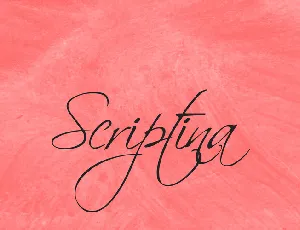
Download Scriptina font free | Apostrophic Labs
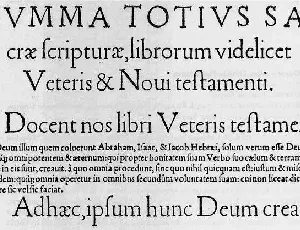
Download Day Roman font free | Apostrophic Labs
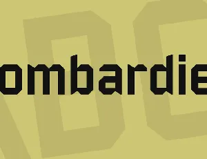
Download Bombardier font free | Apostrophic Labs
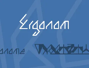
Download Ergonom font free | Apostrophic Labs
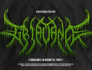
Download Griavance font free | Denustudios
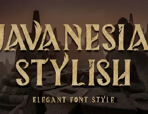
Download Javanesia Stylish font free | Yoga Letter
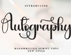
Download Autography Calligraphy font free | Scratchones Creative
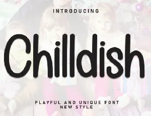
Download Chilldish Display font free | Scratchones Creative
Download Happy Mockup Display font free | Scratchones Creative
Download Ramen Soup Display font free | Scratchones Creative
Download Happy Monday Display font free | creativeletter
Download Victorian Script font free | creativeletter