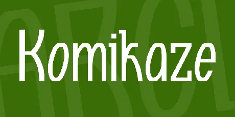
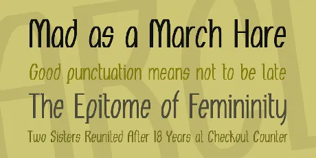
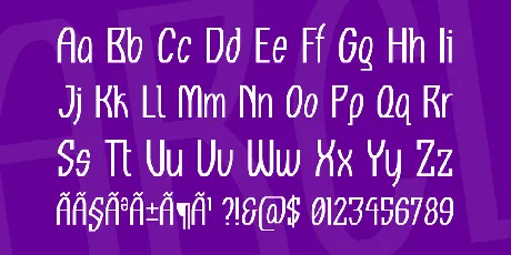
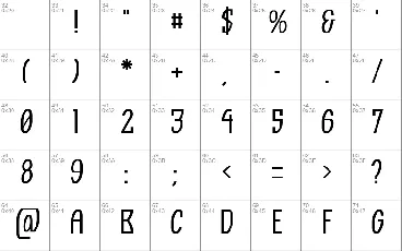
Download free Komikaze font - Apostrophic Labs
About Komikaze font
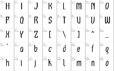
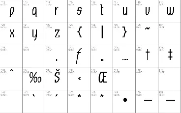
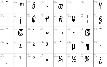
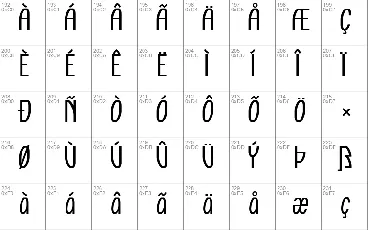
This font contains a few experiments. Initially, it was intended to be a straight-forward comic font based on 7 or 8 characters seen in a 1988 X-Men comic. The ideas for the letters were developed while studying two thick volumes by David Kunzle, named History of the Comic Strip. Kunzle's research enticed me to experiment with angular compatibility between letters of the same alphabet form group. A combination of straight-ups and obliques is hardly ever seen in the same typeface, and one of the goals of this font was to successfully remain within the same atmosphere of aesthetics and legibility while roaming somewhat freely between the vertical rule and 9 degree angling.The drawing and mapping of the basic set of characters didn't take long, and when the first map of the font was ready for the metric work, I thought that perhaps a few tweaks in the spacing would eliminate the need for kerning. One glimpse at Vince Connare's Comic Sans confirmed the thought. But that singular glimpse also made me realize that the latest version of Comic Sans (which is now the most popular and overused comic font since it continues on being shipped with Windows since 1995) supports a couple extra code pages on top of the basic latin alphabet. So there it went; I threw a gauntlet at myself to top Comic Sans in every aspect while remaining within the limits of the original Komikaze idea. That included building as many Unicode-compliant characters as the font's idea would allow, as well as testing the output in most environments where Comic Sans seems to be used (web sites, greeting cards, casual headlines, etc) and trying to surpass it in use and aesthetics. I'm quite happy with the results, but the practical use and future popularity of it depend on the rest of the world. I moved on the moment this file was produced.Along the way, while still reading Kunzle's amazing research, I took a look at what was happening in the world of comics nowadays, and found out that most of the typefaces used for comic books were incomplete sets of characters that oddly cost a lot of money, as compared with complete sets of great text fonts for instance. The freeware/shareware comic font makers also seem to stop at the basic set of 80 characters. A little more research into the digital comic type industry revealed that not more than five comic fonts out there contain complete character sets, let alone support multiple languages. The most commonly used comic fonts that do fit this category seem to be Comic Sans (ships with Windows), Comicrazy ($395 from Active Images; Mac original or badly encoded conversion for PC), Comic Book ($299 from Vanguard Media; PC-original or badly encoded conversion for Mac), and even those seem to have too many glitches in varying degrees, like unfinished international support, incompliance with Unicode, silly overlaps, bad spacing, single-platform limitations, etc. I came to the conclusion that although designers who build comic books are being helped with the fonts that they use, they are still required to do a lot of work to get an even remotely wholesome flexibility from the fonts they are using, whether freeware or commercial. Not to mention the non-existent consideration for comic book designers who would want to use comic fonts for non-western latin languages. How can a Greek or a Russian comic book designer, for instance, use anything other than Comic Sans if there are no fonts for them out there? And what route would aforementioned designer take if intent on not using Comic Sans? Good ol' hand lettering? In a world where comics are slapped together by computers on a daily basis? It was a big surprise to see that comic font producers (mostly North American) seem to be the least professional bunch in the whole of the type industry. Anyhow, whatever bakes their cookies... in Komikaze I tried to eliminate most of the limitations and/or inadequacies I found in most comic fonts out there, and I think it turned out quite well (short of Arabic, Armenian, Georgian, Hebrew, and Indic and Oriental languages, everything is there)... but wait, there's more:One night, while still working on this thing, in a hotel room overlooking cowboy bars, after a few glasses of wine and a lot of loud blues, I got to thinking about a woman I once knew, and remembered that one of the last things she ever told me was that a cataract problem made her lose sight in her left eye. That one thought lead to a whole thingamajig about blind people and how if I were blind I wouldn't be trying to guess the name of every font I see. Are there comic books out there for blind people? Digital lettering for the blind? I was tired enough that night, but that line of thinking sent my curiosity rocketing and I ended up cruising through many sites that deal with blind literacy. A few hours later I had many versions of Braille charts printed out and ready to study. And of course, another surprise was the find that the majority of available Braille fonts out there were expensive, and of the handful of them that happen to be free, not a single one contains the complete set of Braille patterns. A couple days later I finished including 256 Braille patterns in this font (that's the complete set as per Unicode 3.0). And that was that.I also added a few Open Type lookout tables for automatic f-ligature substitutions in the true type version. You'll most likely have no use for these things unless you're a heavy-duty InDesign user. I personally am an Xpress user, and InDesign doesn't do much for me, so the OT tables are there just for the sake of experimentation.Enjoy the show.'
Download font
Free for Personal Use
This fonts are authors' property, and are either shareware, demo versions or public domain. The licence mentioned above the download button is just an indication. Please look at the readme-files in the archives or check the indicated author's website for details, and contact him if in doubt. If no author/licence is indicated that's because we don't have information, that doesn't mean it's free.
Komikaze Regular | KOMIKAZE.ttf
- Font family: Komikaze
- Font subfamily identification: Regular
- Unique identifier: Komikaze
- Full font name: Komikaze
- Version: 1.0;
- Postscript font name: Komikaze
- Designer: Apostrophe (')
- Description: © Apostrophe ('). All rights reserved. [email protected]
- Manufacturer name: Apostrophic Laboratories
- License: This font is free to use by anyone, personally or commercially. If you do use this font commercially, please send a donation of any amount you can afford to your favourite charity. For any questions about this font, send email to [email protected], or visit http://members.home.com/apostrophe for more free fonts. To remain updated about future work at Apostrophic Laboratories, subscribe to the weekly newsletter at http://labcat.listbot.com
Komikaze
This font contains a few experiments. Initially, it was intended to be a straight-forward comic font based on 7 or 8 characters seen in a 1988 X-Men comic. The ideas for the letters were developed while studying two thick volumes by David Kunzle, named History of the Comic Strip. Kunzle's research enticed me to experiment with angular compatibility between letters of the same alphabet form group. A combination of straight-ups and obliques is hardly ever seen in the same typeface, and one of the goals of this font was to successfully remain within the same atmosphere of aesthetics and legibility while roaming somewhat freely between the vertical rule and 9 degree angling.
The drawing and mapping of the basic set of characters didn't take long, and when the first map of the font was ready for the metric work, I thought that perhaps a few tweaks in the spacing would eliminate the need for kerning. One glimpse at Vince Connare's Comic Sans confirmed the thought. But that singular glimpse also made me realize that the latest version of Comic Sans (which is now the most popular and overused comic font since it continues on being shipped with Windows since 1995) supports a couple extra code pages on top of the basic latin alphabet. So there it went; I threw a gauntlet at myself to top Comic Sans in every aspect while remaining within the limits of the original Komikaze idea. That included building as many Unicode-compliant characters as the font's idea would allow, as well as testing the output in most environments where Comic Sans seems to be used (web sites, greeting cards, casual headlines, etc) and trying to surpass it in use and aesthetics. I'm quite happy with the results, but the practical use and future popularity of it depend on the rest of the world. I moved on the moment this file was produced.
Along the way, while still reading Kunzle's amazing research, I took a look at what was happening in the world of comics nowadays, and found out that most of the typefaces used for comic books were incomplete sets of characters that oddly cost a lot of money, as compared with complete sets of great text fonts for instance. The freeware/shareware comic font makers also seem to stop at the basic set of 80 characters. A little more research into the digital comic type industry revealed that not more than five comic fonts out there contain complete character sets, let alone support multiple languages. The most commonly used comic fonts that do fit this category seem to be Comic Sans (ships with Windows), Comicrazy ($395 from Active Images; Mac original or badly encoded conversion for PC), Comic Book ($299 from Vanguard Media; PC-original or badly encoded conversion for Mac), and even those seem to have too many glitches in varying degrees, like unfinished international support, incompliance with Unicode, silly overlaps, bad spacing, single-platform limitations, etc. I came to the conclusion that although designers who build comic books are being helped with the fonts that they use, they are still required to do a lot of work to get an even remotely wholesome flexibility from the fonts they are using, whether freeware or commercial. Not to mention the non-existent consideration for comic book designers who would want to use comic fonts for non-western latin languages. How can a Greek or a Russian comic book designer, for instance, use anything other than Comic Sans if there are no fonts for them out there? And what route would aforementioned designer take if intent on not using Comic Sans? Good ol' hand lettering? In a world where comics are slapped together by computers on a daily basis? It was a big surprise to see that comic font producers (mostly North American) seem to be the least professional bunch in the whole of the type industry. Anyhow, whatever bakes their cookies... in Komikaze I tried to eliminate most of the limitations and/or inadequacies I found in most comic fonts out there, and I think it turned out quite well (short of Arabic, Armenian, Georgian, Hebrew, and Indic and Oriental languages, everything is there)... but wait, there's more:
One night, while still working on this thing, in a hotel room overlooking cowboy bars, after a few glasses of wine and a lot of loud blues, I got to thinking about a woman I once knew, and remembered that one of the last things she ever told me was that a cataract problem made her lose sight in her left eye. That one thought lead to a whole thingamajig about blind people and how if I were blind I wouldn't be trying to guess the name of every font I see. Are there comic books out there for blind people? Digital lettering for the blind? I was tired enough that night, but that line of thinking sent my curiosity rocketing and I ended up cruising through many sites that deal with blind literacy. A few hours later I had many versions of Braille charts printed out and ready to study. And of course, another surprise was the find that the majority of available Braille fonts out there were expensive, and of the handful of them that happen to be free, not a single one contains the complete set of Braille patterns. A couple days later I finished including 256 Braille patterns in this font (that's the complete set as per Unicode 3.0). And that was that.
Technical details about Unicode compliance are at the end of this text file.
This font is free to use by anyone, personally or commercially. If you do use this font commercially, please send a donation of any amount you can afford to your favourite charity. For any questions about this font, send email to [email protected], or visit http://members.home.com/apostrophe for more free fonts. To remain updated about future work at Apostrophic Laboratories, subscribe to the weekly newsletter at http://labcat.listbot.com
The fonts are hinted for type-1 presentation, so I recommend using the type 1 fonts for the screen (as well as printing) if you're going to be accessing just the basic latin set. If you're going to be accessing the extended Latin sets or the Braille patterns, then you'll have to print using the true type font (which was auto-hinted, since the glyphs would have taken a few weeks to hand-hint). The Extras font in the type 1 pack is basically bits and pieces from the true type font.
I also added a few Open Type lookout tables for automatic f-ligature substitutions in the true type version. You'll most likely have no use for these things unless you're a heavy-duty InDesign user. I personally am an Xpress user, and InDesign doesn't do much for me, so the OT tables are there just for the sake of experimentation. If you usually check your .TTF properties with the MS Font Properties Extension, you'll be able to see the supported scripts, language systems, and GSUB OT layout tables under the Features tab.
Enjoy the show.
'
Here's the technical jargon:
a) Supported Code Pages* and Unicode 3.0 ranges (in True Type version only):
- ISO 8859-1 W EU Latin 1
- ISO 8859-2 C EU Latin 2
- ISO 8859-3 TU, MALT, GAL, ESP Latin 3
- ISO 8859-4 Baltic Latin 6
- ISO 8859-5 Cyrillic
- ISO 8859-7 Greek
- ISO 8859-9 W EU + TURKISH Latin 5
- ISO 8859-10 Scandinavian Latin 6
- C0 Controls & Basic Latin (0020 - 007F) - complete
- C1 Controls & Latin-1 Supplement (00A0 - 00FF) - complete
- Latin Extended-A (0100 - 017F) - complete
- Latin Extended-B (0180 - 024F) - complete
- IPA Extensions (0250 - 02AF) - partial
- Greek (0370 - 03FF) - partial
- Cyrillic (0400 - 04FF) - partial
- Latin Extended Additional (1E00 - 1EFF) - partial
- General Punctuation (2000 - 206F) - partial
- Currency Symbols (20A0 - 20AE) - complete
- Letterlike Symbols (2100 - 214F) - partial
- Miscellaneous Symbols (2600 - 26FF) - partial
- Alphabetic Presentation Forms (FB00 - FB4F) - partial
- Braille Pattern Symbols (2800 - 28FF) - complete
* Support offered includes above listed ISO 8859 code pages and their equivalences for Windows, MacOS, DOS, OS/2, and the IBM standard mapping, including Open Systems EBCDIC and IBM International Publishing code pages. The equivalences were not listed because there are too many of them to finish listing in a day or two.
readme
This font is freeware and can be used as is in any context without permission from Apostrophic Laboratories, except to produce material that is racist, criminal and/or illegal in nature. It is prohibited to modify any Apostrophic Laboratories font(s) for repackaging and/or re-release without an express written authorization by the designer(s) of the font(s) or Apostrophic Laboratories. Under no circumstance shall any Apostrophic Laboratories design or font design be sold or purchased. Email [email protected] if you want more information.
More by Apostrophic Labs
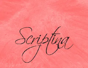
Scriptina font
Download Scriptina font free | Apostrophic Labs
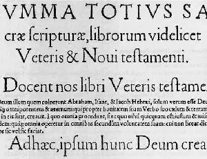
Day Roman font
Download Day Roman font free | Apostrophic Labs
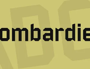
Bombardier font
Download Bombardier font free | Apostrophic Labs
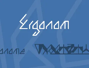
Ergonom font
Download Ergonom font free | Apostrophic Labs
Comments (0)
Lastest update
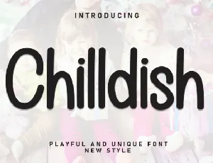
Chilldish Display font
Download Chilldish Display font free | Scratchones Creative
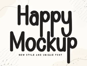
Happy Mockup Display font
Download Happy Mockup Display font free | Scratchones Creative

Ramen Soup Display font
Download Ramen Soup Display font free | Scratchones Creative

Happy Monday Display font
Download Happy Monday Display font free | creativeletter
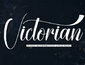
Victorian Script font
Download Victorian Script font free | creativeletter
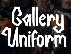
Gallery Uniform Display font
Download Gallery Uniform Display font free | creativeletter

Warriot Tech Display font
Download Warriot Tech Display font free | ffeeaarr
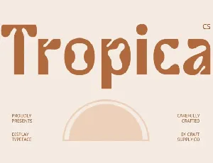
CS Tropica font
Download CS Tropica font free | Craft Supply Co

