Download free Parisine Family font - Jean François Porchez
About Parisine Family font
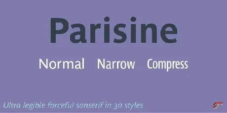
Parisine Font Family is a cutting-edge geometric sans-serif font family crafted for versatility and modern appeal. This family of characters has become over the years one of the symbols of Paris, as is the case with Johnston for the London “Underground” or Helvetica for the New York “Subway”. The Parisine was created to accompany travelers in their daily uses: ultra-readable, friendly, human while the context is a priori hostile.
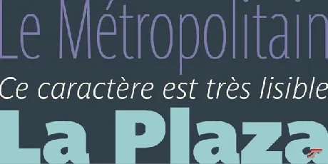
Available for all types of uses, Parisine is a family of linear type characters, powerful, super readable , economical, suitable for all kinds of uses that can be considered as a more human alternative to the industrial style character, which is Din. More human does not mean playful and not serious: no ultra cursive f, v, w in italics in order to maintain a certain regularity essential in information design, signage work, and all subjects where readability, sobriety must be at the forefront: more human, while remaining rigorous. Used for editorial projects, the Compress version improves your titles, banners, allowing large-size compositions on your pages. The Narrow version, associated with the standard width version will be very useful when space is limited.
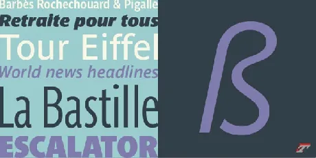
Parisine is organized into different hunts and subsets, from the original Parisine family, Parisine Gris with lighter versions of the usual normal and bold, Parisine Clair and its ultra-light weight variants, to Parisine Sombre with its frank and black weights in the spirit of Frutiger Black, Antique Olive Nord. Many years of adjustments were necessary to refine this complex family.
Parisine was originally designed by Jean François Porchez in 1996 for RATP to meet the need for highly legible signage. Parisine remains the official character for public transport in Paris, the world capital of tourism, and is now an integral part of the French touch.
Each member of the family is composed of more than 720 glyphs and has thousands of pair approaches for a regularity of text composition. In addition to the small caps available in all styles and widths, 4 series of numbers are provided, proportional and tabular, in capital and lowercase versions. With the function of contextual variants , a short f will automatically position itself in place of the standard f in front of certain glyphs such as the ì. One of the characteristics of the original Parisine was in particular its disconnected f ligatures drawn to ensure perfect readability of texts to be read in signage (and therefore to be seen), where the use of traditionally attached ligatures was not suitable. With the version of OpenType fonts and style set 3, the disconnected f ligatures are transformed into traditional attached ligatures. The contextual variants automatically exchange the entry of: “space-middle hyphen-space” by a middle hyphen and its adjacent thins. Style 5 proposes replacing the new connected cedilla c with the old one, drawn disconnected. Style 6 allows access to the arrows in positions Aa to Hh.
Thanks very much to Jean François Porchez. Parisine Font just personal use only, if you need for commercial use and full version please download in here.
Download font
Free for Personal Use
This fonts are authors' property, and are either shareware, demo versions or public domain. The licence mentioned above the download button is just an indication. Please look at the readme-files in the archives or check the indicated author's website for details, and contact him if in doubt. If no author/licence is indicated that's because we don't have information, that doesn't mean it's free.

