
Download free Tycho'sElegy font - Pia Frauss
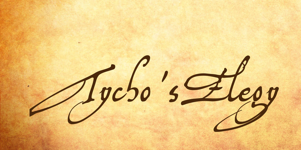


About Tycho'sElegy font
The events that drove Tycho Brahe out of Hven, and out of Denmark, in 1597, seem to be a rather sordid affair. Most sources blame Tycho himself for it -- he had developped primadonna attitudes, he had been mean to his subjects at Hven, and so on. However, there can be no doubt that king Christian IV was the person responsible. All the alleged wrongs that were laid at Tycho's door, had existed for quite some time. Yet Christian IV's father seems to never have cared about them. It was Christian IV who jumped at every pretext that allowed him to get rid of Tycho -- even reaching as low as having Tycho's morganatic wife called, Tycho's mistress, which is the more upsetting, since Christian, some years later, took a morganatic wife himself! Certainly, Christian never gave any consideration to peasants' and fishermen's complaints, except when it fit his purpose (otherwise, he might have been obliged to boot a great deal of his nobles out of his kingdom). In Tycho's case, it did. Christian IV regarded Tycho as a welcome occasion to economize, and his device seems to have been, from the start, 'war, not science'.
Well, after king Christian had cancelled, first Tycho's Norwegian fief, and then his pension, Tycho retired from Hven, first to Copenhagen, then to Rostock, and then to the castle of Wandsbeck, near Hambourg. At last, he accepted an offer from the German emperor, Rudolf II, and went to settle at Prague, where Rudolf resided (and, guess what? Rudolf, though a rather disturbed person himself, never felt offended by Tycho's alleged lack of submission, and primadonna ways, either). In the interim, at Wandsbeck, after leaving the service of a king who had plenty of money, but wouldn't give him any, and before entering the service of an emperor who would have given him plenty of money, but hadn't any, Tycho wrote his famous parting poem, AD DANIAM ELEGIA -- an eloquent diatribe wherein he complains darkly about ingratitude, intrigues, envy, malice, and ignorance. He, too, didn't dare to blame the king. It was that odious court camarilla that was out to undo him...
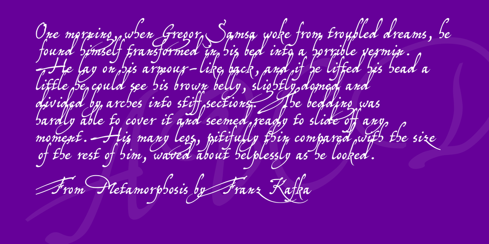
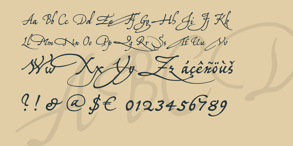
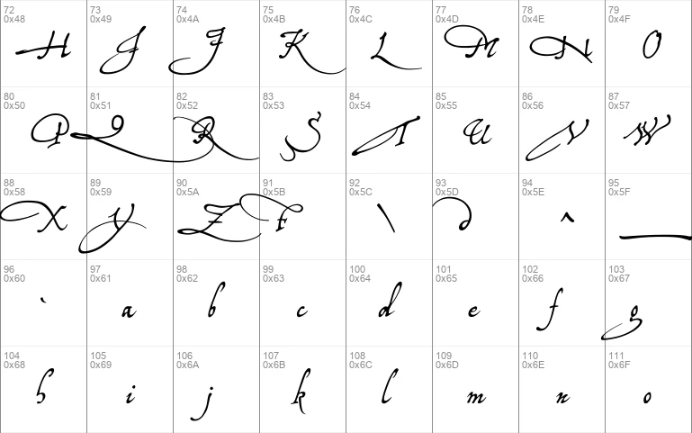
An autograph version of Tycho's Elegy, three and a half pages long, dated "1597 20 die Octobris", is on show among the digital exhibits of the Royal Library of Denmark (= Det Kongelige Bibliotek). This, now, is really Tycho's handwriting. More: if it's his handwriting, it is his calligraphy. It's a studied humanistic cursive, containing no traces of any local bastard style, the middlezone looking rather compressed, and angular, whereas many of Tycho's capitals are daring, swashy, and very roomtaking. When I was designing my font, based on Tycho's manuscript, his capitals were frequently off-limits -- e.g., there is no way to reproduce an I that cuts down through the next three lines, in a font! Luckily, Tycho is nowhere shy of capitals; for many of them, it is just pick and choose -- but of course, the poem being in Latin, I had to invent a K, Y, Z, X, and U. Since the name of Wandsbeck is mentioned in the text, Tycho even provided a W, though it shows that, with regard to this character, he may have been lacking experience. BTW, considering at what moment in his life Tycho wrote his elegy, it's fascinating to observe, how so many of his initals are giving the impression that they are carrying a huge, heavy burden around.
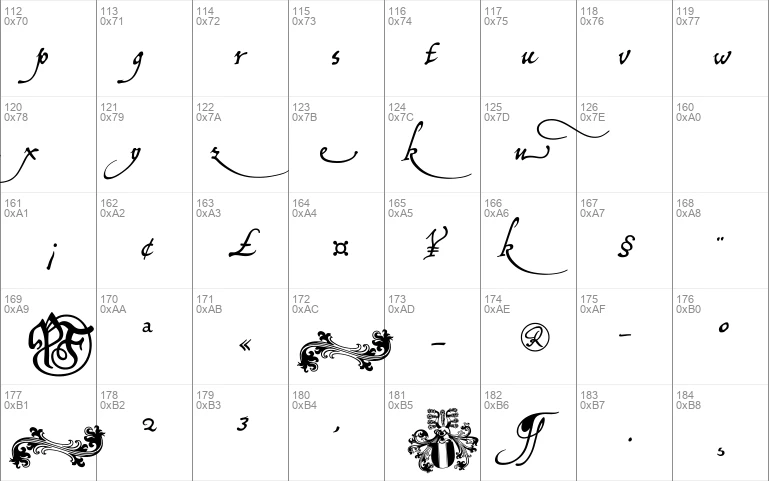
There is no number sign in this font. In its place, you'll find a long s. Other extras in this font are:
- an alternate g on the 'less than' sign
- an alternate y on the 'greater than' sign (that should be used with the regular g)
- a swashed t on the right bracket
- an alternate d, turned left, on the left bracket
- an ending e on the right curly bracket
- an ending n on the left curly bracket (can also be used as an u)
- a swashed k on the bar and broken bar sign
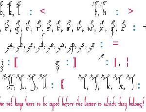
- a swash on the ASCII tilde. It has to be typed like an accent, before the letter to which it belongs, and looks nice with b, f, h, both _k_s, and l, especially before the second of a double l. Of course, Tycho would not use that. I made it up, according to the swashed t, which was really penned by Tycho.
- a double long s on the long s sign.
- The ASCII tilde has been relocated to the 'almost equal to' sign.
The image on the micro sign is my rendition of the Brahe coat of arms, and I cheated with the font name: the y at the end of 'Elegy' is the alternate one, since the regular g and y don't look well together.
Download font
Free for Personal Use
This fonts are authors' property, and are either shareware, demo versions or public domain. The licence mentioned above the download button is just an indication. Please look at the readme-files in the archives or check the indicated author's website for details, and contact him if in doubt. If no author/licence is indicated that's because we don't have information, that doesn't mean it's free.
- TychoElU.ttf
Tycho'sElegy Regular | TychoElU.ttf
- Font family: Tycho'sElegy
- Font subfamily identification: Regular
- Unique identifier: Tycho'sElegy:Version 1.00
- Full font name: Tycho'sElegy
- Version: Version 1.00 June 2010, initial release
- Postscript font name: TychosElegy
- Designer: Pia Frauss
- Description: Tycho'sElegy was created with Font Creator from High-Logic.com
- License: If you want to use this font commercially, please visit http://www.pia-frauss.de/imp/cu.htm
TychosElegy
Tycho'sElegy (UNICODE)
__________________________________________________
... is a font created by Pia Frauss in 2010, with High-Logic's FontCreator. You have downloaded version 1.00.
You are welcome to enjoy this font.
The Tycho'sElegy font is free for private use. For commercial use, please visit my "Conditions of Use" page at
http://www.pia-frauss.de/imp/cu.htm
This font is based on an Tycho Brahes handwriting, i.e., an autograph version of his poem AD DANIAM ELEGIA, on show among the digital exhibits of the Royal Library of Denmark:
http://www.kb.dk/permalink/2006/manus/742/eng/133+recto/
There is no number sign in this font. In its place, you'll find a *long s*. Other extras in this font are:
- an alternate *g* on the 'less than' sign
- an alternate *y* on the 'greater than' sign (that should be used with the regular *g*)
- a swashed *t* on the right bracket
- an alternate *d*, turned left, on the left bracket
- an ending *e* on the right curly bracket
- an ending *n* on the left curly bracket (can also be used as an *u*)
- a swashed *k* on the bar and broken bar sign
- a swash on the ASCII tilde. It has to be typed like an accent, before the letter to which it belongs, and looks nice with *b*, *f*, *h*, both *k*s, and *l*, especially before the second of a double *l*. Of course, Tycho would not use that. I made it up, according to the swashed *t*, which was really penned by Tycho.
- a double *long s* on the long s sign.
- The ASCII tilde has been relocated to the 'almost equal to' sign.
The image on the micro sign is my rendition of the Brahe coat of arms.
_________________________________
Disclaimer:
1. The designer as well as owner of this font is Pia Frauss.
2. This is a free font, but it is restricted to personal use only. Commercial use may be obtained by paying a licensing fee.
3. This font may not be included in any commercial compilation of fonts, be it on CD, disks or other products, without the owner's permission.
4. Altogether, this font may not be used for commercial ends and financial gain without the owner's permission.
5. This font may be freely distributed, as long as the zipfile, including this text, remains unaltered.
6. This font comes as it is. There is no warranty -- express or implied -- offered by the owner, or supplier. The risk of any losses or damages resulting from the use of this font remains wth the user.
If you need any information not supplied by this or by the http://www.pia-frauss.de/ website, please write to fonts @ pia-frauss.de (please remove the spaces around the *@* before copying the address into your mail form).
(However, please note that no enquiries such as "how do I download/install/get such and such program to work with your fonts" will be answered in the future.)
More by Pia Frauss
XIPAROS font
Download XIPAROS font free | Pia Frauss
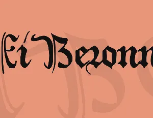
XiBeronne font
Download XiBeronne font free | Pia Frauss
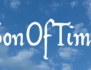
SonOfTime font
Download SonOfTime font free | Pia Frauss
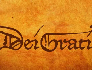
DeiGratia font
Download DeiGratia font free | Pia Frauss
Comments (0)
Lastest update
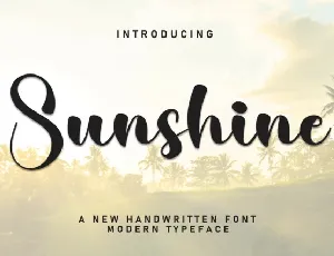
Sunshine Script font
Download Sunshine Script font free | creativeletter
Monday Display font
Download Monday Display font free | Scratchones Creative

Smart Kids Display font
Download Smart Kids Display font free | Scratchones Creative

Sunshine Display font
Download Sunshine Display font free | Scratchones Creative
Neometra Caps font
Download Neometra Caps font free | deFharo

Syncro Family font
Download Syncro Family font free | Out of the Dark Typefaces
Nothing Magic font
Download Nothing Magic font free | timelesstype.co
Rocket Spin font
Download Rocket Spin font free | Rais Project Studio