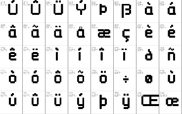
Download free Wellbutrin font - Apostrophic Labs
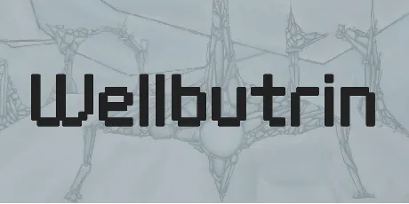
About Wellbutrin font
Karen Clemens lives in Bruges, Belgium. She's 34 years old, has 4 kids, employs 14 people in her own design firm, sleeps 3 hours a day, likes bloody steak, and is happier than a clam buried in the sand. She likes to call herself an "expat", which is short for ex-patriot. Karen was born and bread in Vancouver, Canada. She met her husband some 12 years ago, then moved with him to Belgium a couple years later.
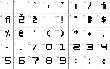
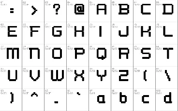
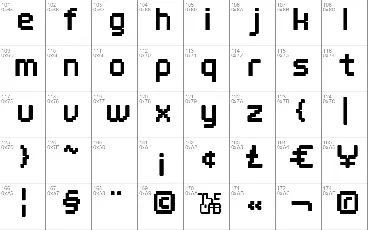
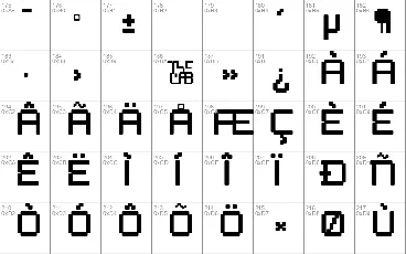
The first few letters of Welbutrin didn't look anything like they do now. It originally started as an experiment with bitmaps, where Karen turned a 12 point bitmap version of Helvetica Round into scalable outlines. At 12 points the font was certainly Helvetica Round, but at 70 and above, it looked like a blown-up version of what you see on your cell phone screen. She was impressed by that and asked me to help her out with it. I said no way, but a sample of some of her letters at 130 points gave me an idea: what if the characters were all made of rounded rectangles, like the ones that can so easily be made with the Illustrator tool?
Karen liked the idea. We exchanged grids and started working, at the pace of 2 hours a day. A couple weeks later we realized that the grids we were using were pretty good for weights of over 100 points, but really bad for anything under 70 points. So I regridded and we redrew everything while keeping in mind that we wanted this font to look as good as a rounded techno can at 14 points.
Karen wants to dedicate this to Kelly, her 5 year old kid.
I want to dedicate this to the guy from Neuropolis, Ray Larabie, the man who for 4 years now has kept on continuing the Rakowski revolution, even long after Rakowski himself sold out.
Keep on shocking in the free world.
© 2000, Karen Clemens & Apostrophe ('). All rights reserved. Distribute freely. [email protected]
Download font
Free for Personal Use
This fonts are authors' property, and are either shareware, demo versions or public domain. The licence mentioned above the download button is just an indication. Please look at the readme-files in the archives or check the indicated author's website for details, and contact him if in doubt. If no author/licence is indicated that's because we don't have information, that doesn't mean it's free.
Wellbutrin Regular | Welbut__.ttf
- Font family: Wellbutrin
- Font subfamily identification: Regular
- Unique identifier: KarenClemens&Apostrophe('): Wellbutrin: 2000
- Full font name: Wellbutrin
- Version: Version 1.0;
- Postscript font name: Wellbutrin
- Designer: Apostrophe (')
- Description: © 2000, Karen Clemens & Apostrophe ('). All rights reserved. Distribute freely. [email protected]
readme
This font is freeware and can be used as is in any context without permission from Apostrophic Laboratories, except to produce material that is racist, criminal and/or illegal in nature. It is prohibited to modify any Apostrophic Laboratories font(s) for repackaging and/or re-release without an express written authorization by the designer(s) of the font(s) or Apostrophic Laboratories. Under no circumstance shall any Apostrophic Laboratories design or font design be sold or purchased. Email [email protected] if you want more information.
Welbut this
Karen Clemens lives in Bruges, Belgium. She's 34 years old, has 4 kids, employs 14 people in her own design firm, sleeps 3 hours a day, likes bloody steak, and is happier than a clam buried in the sand. She likes to call herself an "expat", which is short for ex-patriot. Karen was born and bread in Vancouver, Canada. She met her husband some 12 years ago, then moved with him to Belgium a couple years later.
The first few letters of Welbutrin didn't look anything like they do now. It originally started as an experiment with bitmaps, where Karen turned a 12 point bitmap version of Helvetica Round into scalable outlines. At 12 points the font was certainly Helvetica Round, but at 70 and above, it looked like a blown-up version of what you see on your cell phone screen. She was impressed by that and asked me to help her out with it. I said no way, but a sample of some of her letters at 130 points gave me an idea: what if the characters were all made of rounded rectangles, like the ones that can so easily be made with the Illustrator tool?
Karen liked the idea. We exchanged grids and started working, at the pace of 2 hours a day. A couple weeks later we realized that the grids we were using were pretty good for weights of over 100 points, but really bad for anything under 70 points. So I regridded and we redrew everything while keeping in mind that we wanted this font to look as good as a rounded techno can at 14 points.
Karen wants to dedicate this to Kelly, her 5 year old kid.
I want to dedicate this to the guy from Neuropolis, Ray Larabie, the man who for 4 years now has kept on continuing the Rakowski revolution, even long after Rakowski himself sold out.
Keep on shocking in the free world.
'
More by Apostrophic Labs
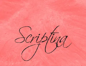
Scriptina font
Download Scriptina font free | Apostrophic Labs
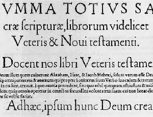
Day Roman font
Download Day Roman font free | Apostrophic Labs
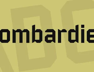
Bombardier font
Download Bombardier font free | Apostrophic Labs
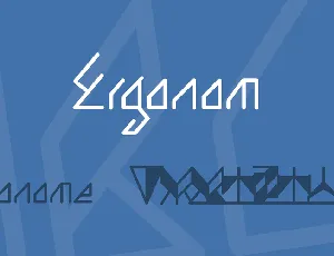
Ergonom font
Download Ergonom font free | Apostrophic Labs
Comments (0)
Lastest update
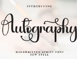
Autography Calligraphy font
Download Autography Calligraphy font free | Scratchones Creative
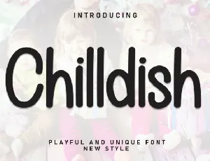
Chilldish Display font
Download Chilldish Display font free | Scratchones Creative
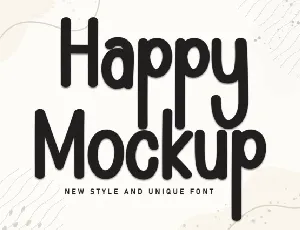
Happy Mockup Display font
Download Happy Mockup Display font free | Scratchones Creative

Ramen Soup Display font
Download Ramen Soup Display font free | Scratchones Creative

Happy Monday Display font
Download Happy Monday Display font free | creativeletter
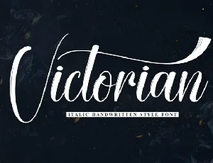
Victorian Script font
Download Victorian Script font free | creativeletter
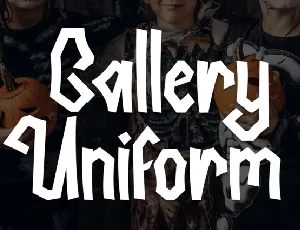
Gallery Uniform Display font
Download Gallery Uniform Display font free | creativeletter

Warriot Tech Display font
Download Warriot Tech Display font free | ffeeaarr

